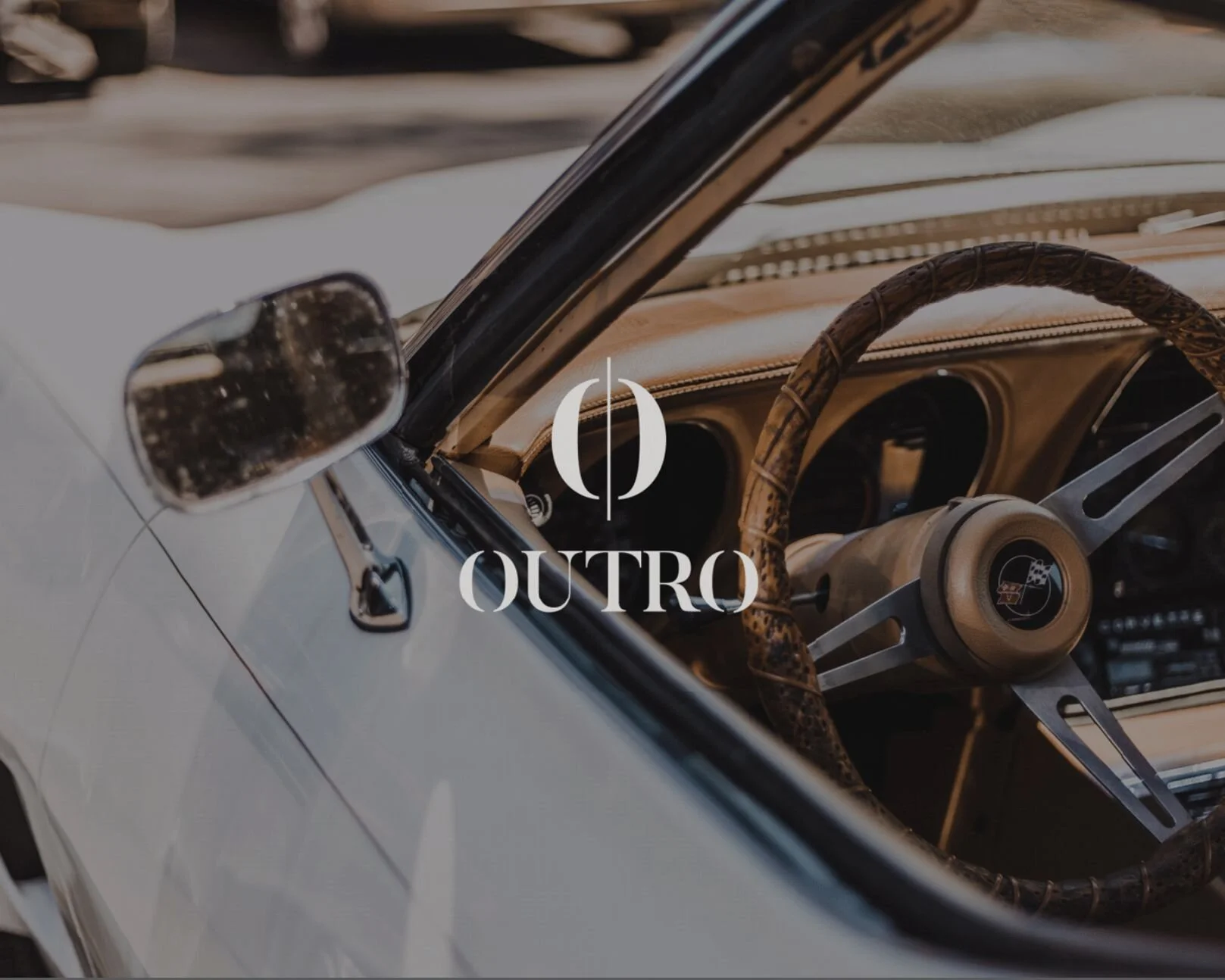
Outro Co.
Brand Identity & Art Direction
Outro Co. needed a visual identity that reflected the musicality embedded in its name while evoking a sense of luxury and refinement. The brand was developed for individuals who are tenacious, focused, and aspirational in both mindset and lifestyle.
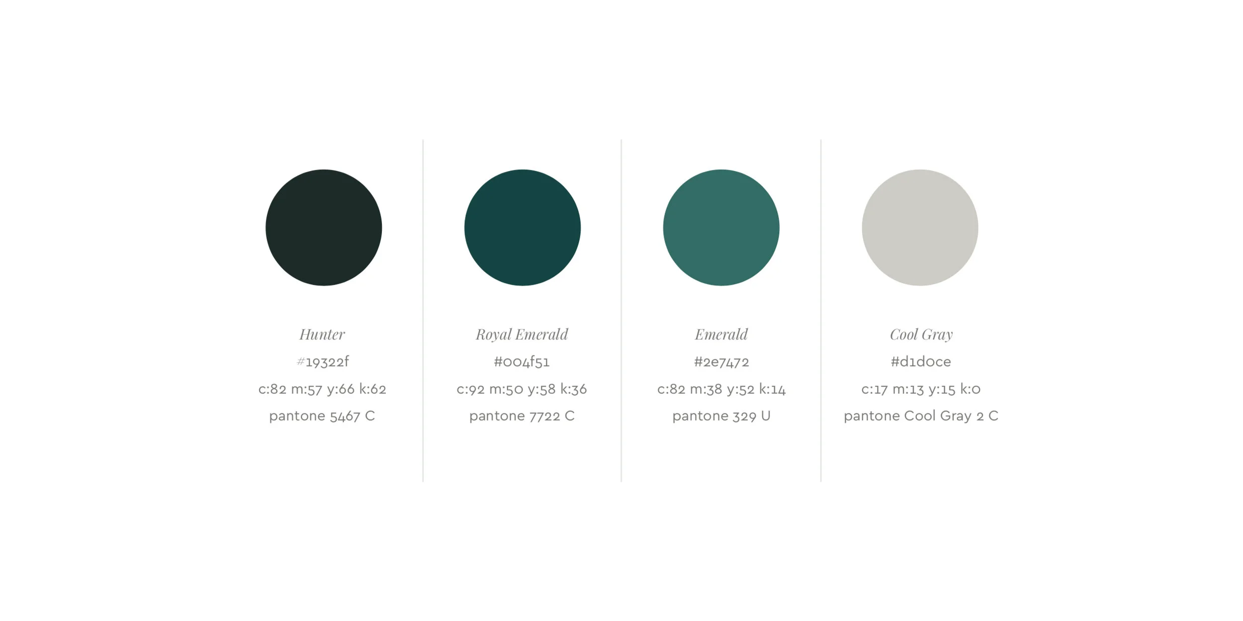
The logo draws from a classic serif typeface, refined through a custom treatment inspired by musical notation. A horizontal bar—referencing music staff lines and rhythm—flows through the icon and is echoed in the circular forms of the letter O, creating a sense of visual harmony and cohesion between the icon and wordmark.
Brand Identity
Art Direction
Design
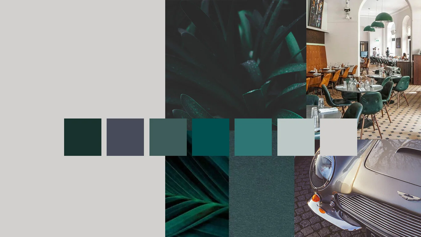
“The colors are rich but muted, the lighting is dramatic, the people are attractive yet unique."